05_08
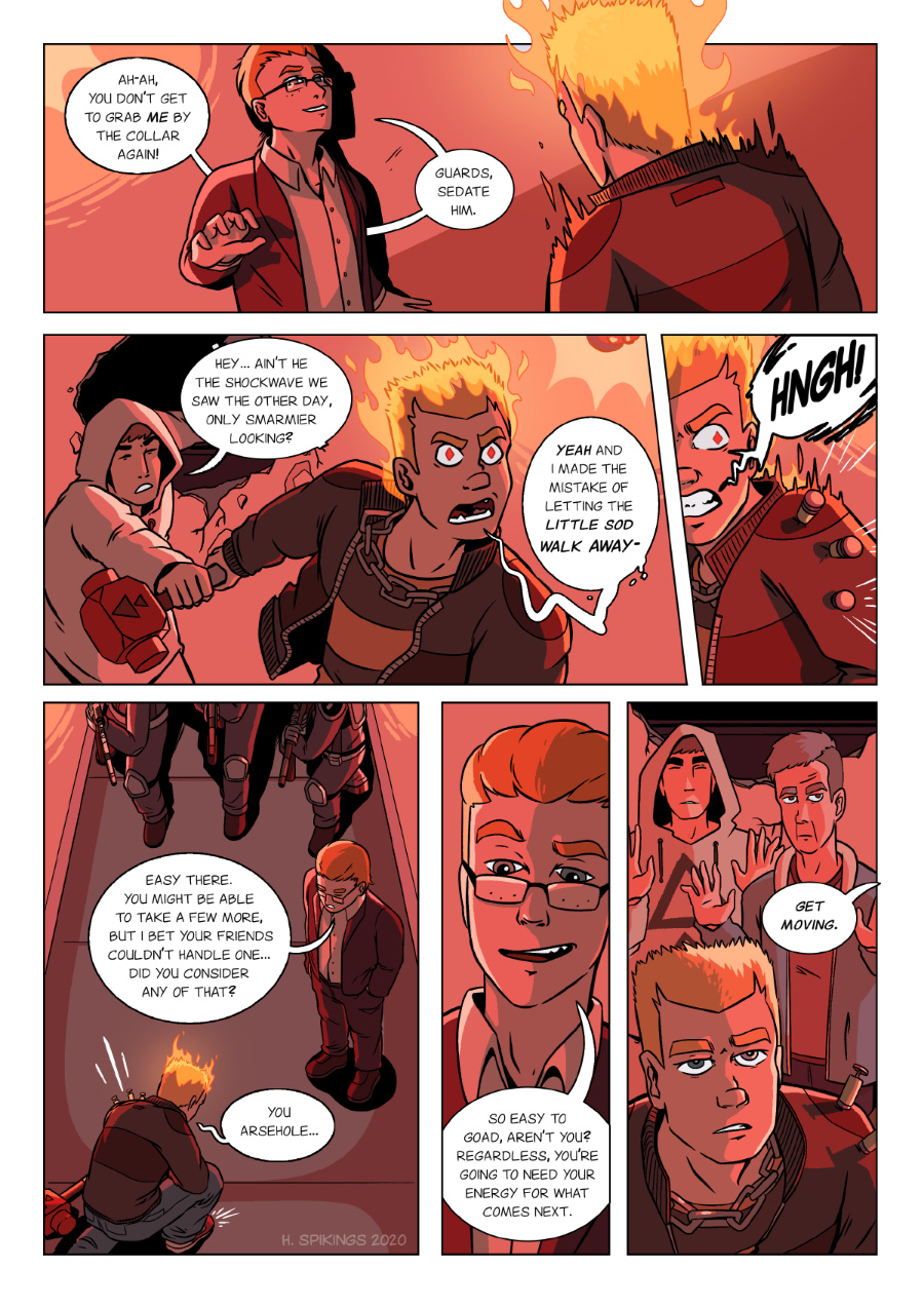
Robert, forever the expert on thinking things through before acting on his own emotions!
In terms of page development, I went a little more red with this one than the previous page. Not sure whether it’s better, but it’s all about trying small new things to make the comic better. Also, how does the lighting look? I’ve been getting tired of how broken some of my lighting has looked in previous chapters, and I want to work on fixing that. Hopefully there’s some difference, or at least, not a negative difference!
Patreon || Vote for APOC || Twitter


Oh, well done Nath. If there was a more asinine move than to grab Robert’s sledgehammer I can’t envision it. Apparently Robert isn’t the only one who sits on his brains. ><
Art-wise, since there are quite a few flashing red lights, having a reddish cast to everything is only natural. 🙂
Funny thing–I don't remember any unendurable lighting gaffes. At this point, it would probably be well to remember that we readers take out cues from what you draw, and unless there is a glaring discrepancy, will tend to accept the scene–lighting and all–as correct, and any calculation of viewing angles and object location are more for your benefit than ours. Personally, I think that while you can do layouts with algorithms, your heart does a better job. ^^
Fwiw, the guy in the hoodie isn’t Nath – Nath is back at the Red Stables right now, but more on him later… 😉
And thanks for the pointer on lighting, didn’t really think of it that way 🙂 I’m definitely looking at pages from more or a technical standpoint by the time they’re almost finished because I’ve spent most of the first few hours on them giving them the heart/emotion I think they need.
I knew that, now that I think of it. Nath basically told Robert to be careful as he watched them leave. ><
Agreed on the lighting question. Artists are so self-critical …