05_02
Time to stop beating around the bush.
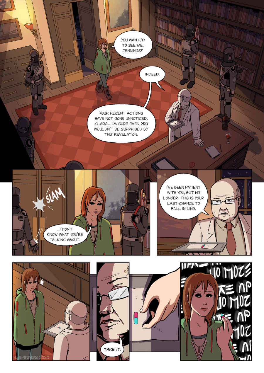
So my plan to simplify my comic style a little to speed up production backfired in panel 1. What can I say, I love to make establishing shots that look pretty. Any beady-eyed readers might notice a few changes in the guard uniform and office – reason being it’s going to help me retain my sanity for what’s coming next! 😀
I want to get to a place where I can make two of these pages a week, but right now I can scrape by with 1 and a bit. I’ll try not to let the quality of the comic get in the way of that, but I need to speed up with things if I want to finish this comic one day!
Patreon || Vote for APOC || Twitter


I can feel your frustration. As a fan, I’ll be happy with whatever you manage. You are appreciated.
Now, as for what her spirit is yelling: “No more” and “Wake up”. Perhaps she’s dreaming right now? Or maybe it’s a plea to unleash her power.
Thank you for the support, I really appreciate it! These pages aren’t as difficult to do as they used to be, but the length each one takes is definitely more than I like right now. All the same, I’m glad the quality shows through.
Well, not puttting bookshelves in the picture should save about 1/3 of the time spent. ^^
Seriousy, though, I understand the tension between wanting to be proud of your work, and feeling like you’re cheating us by simplification, and the hard, cold fact that there are only 24 hours in a day. My persnal take on the problem is that while sloppy work is a drawback, simplified design is not.
As I like to say (and frequently do) , remember that we don’t see what you wanted to draw, we only see what you did, and, unless there is a matter of continuity, we don’t miss what isn’t there. Look, all cards on the table, here. You are an exceptionally good artist (and one heck of a storyteller). I read a LOT of webcomics, and you’re easily in the top one tenth of one percent in artistic ability. With chops like that, don’t stress about simplifying a few backgrounds. 🙂
Thank you so much, your comment gave me some much needed energy to tackle the current page that needs finishing (page 6 as of writing this)!
Trying to strike that balance between simplifying design and not cutting cheap corners is difficult – especially because when I was younger I thought “adding detail makes art better” – a habit that is hard to break. But APOC is definitely helping with that, and in the next couple of pages you might see some ways in which I’ve tried to simplify the work (bookshelves are indeed going to be tackled!!)
Thank you again, really needed to hear this today. 🙂
It’s astonishing that they keep putting that scythe within 10 feet of her. I’m guessing it’s something that simply needs to be there (it can’t be further from her in an absolute sense) or there’s a good reason for it (she’ll wig out faster if it’s further away)